Using the Power of UX for Good or Bad

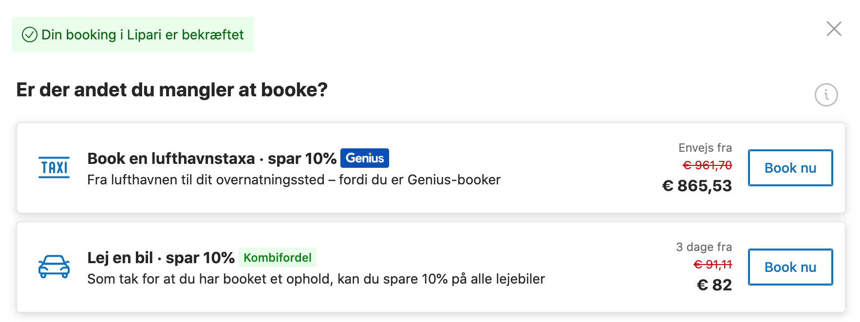
You can easily manipulate users. Using design tricks to confuse and deceive users is known as “Dark UX,” and Airbnb has been an enthusiastic practitioner. For example, American users have always been surprised that their great deals look much less great after humongous compulsory “cleaning fees” are added at the last step.

I never saw this trick in Denmark because such shenanigans are illegal here. Airbnb power users know to search for Airbnb rentals in the US on the Australian site because deceptive practices are also illegal there.

Under pressure from users and regulators, Airbnb has stalled for years, implausibly claiming technical challenges in displaying the total price. However, it seems like the pressure has now grown too big to ignore, and even Americans should shortly be able to see the actual price.

User Experience knowledge is meant to help users, not trick them. You don’t want your company to become a byword for deception like Airbnb has become.

Handing Off Your Problems to Someone Else

Today is the day when up to 300,000 Danes can no longer access their online banking. They also cannot use any of the gazillion public services that require a login. That’s because the old public ID system in Denmark has been retired, and everyone has to use the insecure and shoddily built new one.

The reason thousands of people are left behind is the cumbersome signup process that – among other things – involves scanning the chip in your passport with a modern smartphone. It turns out many people can’t figure out how to do that. But that is not a problem for the organization behind the ID system. They simply tell users to show up at the local service point in their town for help.

It is, however, a problem for the overworked local service center employees. They are staffed to (barely) manage their usual work. Dumping 500,000 IT support tasks on them has predictably led to huge waiting times for an appointment for anything.

Don’t allow your IT systems to dump their problem somewhere else and declare themselves a success.

Letting a System Give Ridiculous Answers

Here is another example of a computer giving a ridiculous answer. When I book a hotel, Booking.com will automatically suggest an airport transfer. OK, but not when the airport is 200 kilometers and a long ferry ride away. Providing meaningless answers to your users is not a trivial problem that you can brush off. It undermines the confidence your users have in a system, usage drops, and shadow systems in excel proliferate. Do you have a policy to build sanity checks into your systems?

Do You Want Fancy, Cheap, or Usable?

Do you prefer fancy, cheap, or useful? Car manufacturers have found that touchscreens look fancy and are cheaper than physical buttons. That’s why modern cars have touchscreens and no buttons. I prefer buttons, and science is on my side. A survey shows that it is almost twice as fast to perform common car tasks with buttons than with a touchscreen.

Unfortunately, a car is not required to be easy to operate. Aircraft cockpits, on the other hand, are full of physical buttons. An aircraft manufacturer accepts the extra cost of physical controls to provide an optimal user experience for the pilot.

Marketing wants fancy. Finance wants cheap. User Experience wants usability. Who has the last word on product design in your organization?

The Tolstoy Principle in Action

This is what failure looks like: 50% one-star reviews. The other half is five-star reviews. Assuming these are not all from the app developers themselves, the app apparently can work. It just didn’t work for me, nor for many others.

I call this the Tolstoy principle: All successful apps are alike; each unsuccessful app is unsuccessful in its own way. The end-user does not care that 98% of your back-end infrastructure is running. They care that they can complete their task. And if one critical component fails, your app is a failure. Like this one from my local supermarket chain.

When you build systems, is all the attention lavished on a cool front-end app? Unsexy back-end services are equally important.

Improve Internal IT

If you think it hard to retain IT talent, spare a thought for the leader of customer service. 83% of customer service agents feel overworked and 62% consider quitting. IT cannot give them a pay rise or remove obnoxious customers, but we can give them useful IT systems.

28% of customer service workers agree completely or somewhat that their IT systems help them do their job. That leaves 7 out of 10 who feel their IT is working against them. When was the last time you sent an expedition out into the trenches of your organization to find out what was bothering your users the most? Sometimes, there are little things that IT can easily do to dramatically improve the effectiveness of internal IT.

Fancy or Usable?

Do you want something that works or something that looks fancy? Sometimes, these two objectives come into conflict. Too often, the IT professionals can’t imagine a solution that does not involve touchscreens and mobile apps.

I’m staying in an upscale hotel in New York this week, and the control panel for heating and lighting is definitely old-school. But it works. And it can be understood and operated by every age group likely to frequent the hotel.

Meanwhile, back in Denmark, we are currently rolling out a new central authentication system. You will have to figure it out in order to do online banking or access public services. It was designed by tech-savvy young people and is very fancy. Too bad it has left hundreds of thousands of non-computer-literate citizens desperately calling the understaffed phone helpline.

Are you sure the solutions you roll out have been tested by the entire target audience?

User Blaming

The IT industry has its own version of victim blaming. I call it user blaming. That is what happens when you build an IT system without proper regard for the users’ reality. When the purported benefits do not materialize, the vendor points to the convoluted and impractical instructions given and claims that if only the users would follow the instructions, the system would work as advertised.

I was reminded of user blaming this weekend. I had worn out the burrs on my coffee grinder, and as is sadly often the case, a replacement part was more expensive than a new machine. Being a professional, I always read the instructions. They told me to clean the machine after each use. Since I only grind what I need, that would mean several cleanings a day. And the cleaning involved six steps, washing everything in lukewarm water, emptying out the beans, disassembling the grinder, cleaning the burrs with the supplied cleaning brush, and much more.

That is an abdication of responsibility. Just like when an IT vendor provides unrealistic and impossible-to-follow CYA instructions. Take responsibility. Build a quality product that works in real life.

Google Just Challenged You

Google just challenged your IT organization. They created a free version of their Workspace plan where users get collaboration spaces, chat, video conferencing, and the usual Google programs Sheets, Slides, and Docs.

This dramatically increases the risk that people in your organization will create a free Google Workspace Essentials account and run their projects from there. That means all your data is under the control of Google instead of you. If the person who set up the Workspace forgets to appoint another administrator and leaves the company, your data is stuck on Google servers with no option to apply the corporate data governance.

To face this challenge, you need a stick and a carrot. The stick is an official policy prohibiting unauthorized collaboration spaces on third-party servers. The carrot is officially approved collaboration software with great usability. It’s easy to create the stick, but it doesn’t work without the carrot. Do you have the carrot?

User Experience Disasters

This week’s episode of my podcast Beneficial Intelligence is about User Experience disasters. Danes consistently rank among the happiest people in the world, but I can tell you for sure that it is not the public sector IT we use that makes us happy. We have a very expensive welfare state financed with very high taxes, but all that money does not buy us a good user experience.

Good User Experience (UX) is not expensive, but it does require that you can put yourself in the user’s place and that you talk to users. That is a separate IT specialty, and many teams try to do without it. It doesn’t end well. Systems with bad UX do not deliver the expected business value, and sometimes are not used at all. A system that is functionally OK but that the users can’t or won’t use is known as a user experience disaster.

We have a web application for booking coronavirus testing here in Denmark. First you choose a site, then you chose a data, and then you are told there are no times available at that site on that date. If a UX professional had been involved, the site would simply show the first available time at all the testing centers near you. We now also have a coronavirus vaccination booking site. It is just as bad.

As CIO or CTO, some of the systems you are responsible for offer the users a bad experience. To find these, look at usage statistics. If you are not gathering usage, you need to start doing so. If systems are under-utilized, the cause is most often a UX issue. Sometimes it is easy to fix. Sometimes it is hard to fix. But IT systems that are not used provide zero business value.

Listen here or find “Beneficial Intelligence” wherever you get your podcasts.